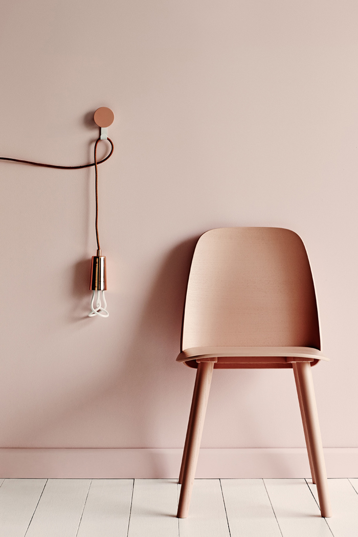
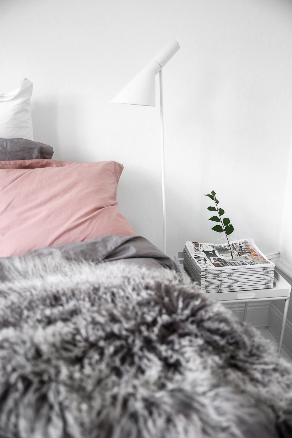
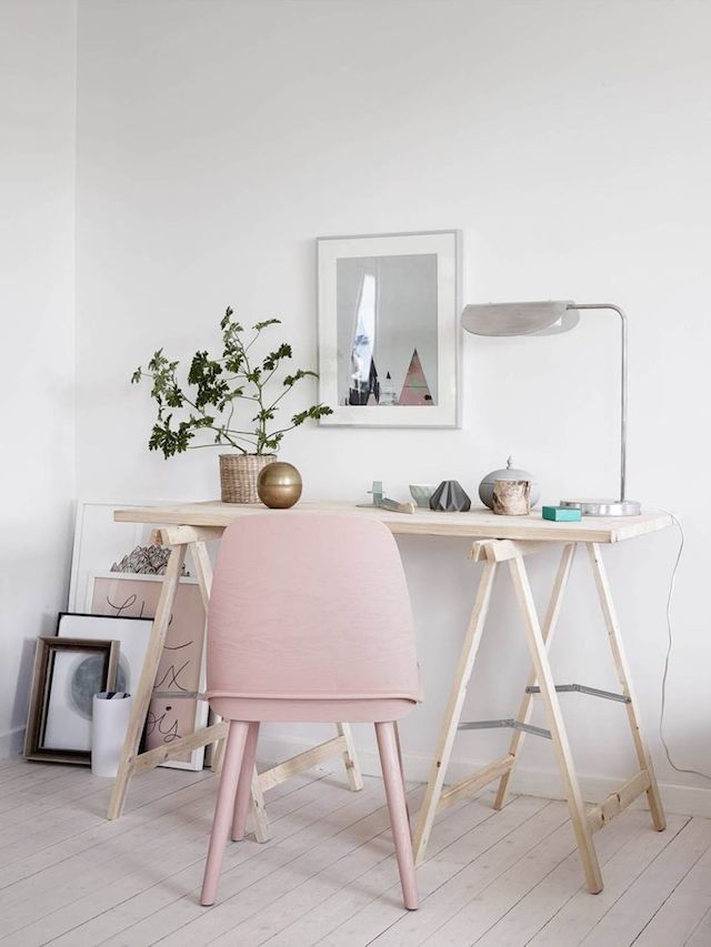
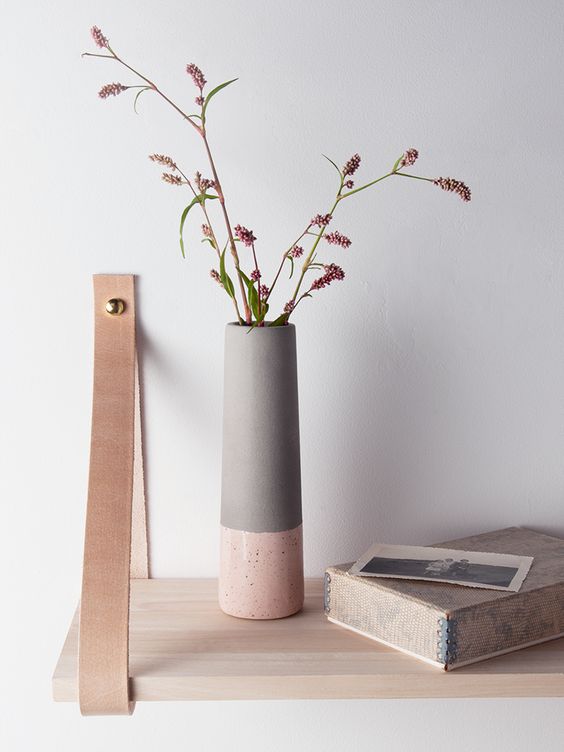
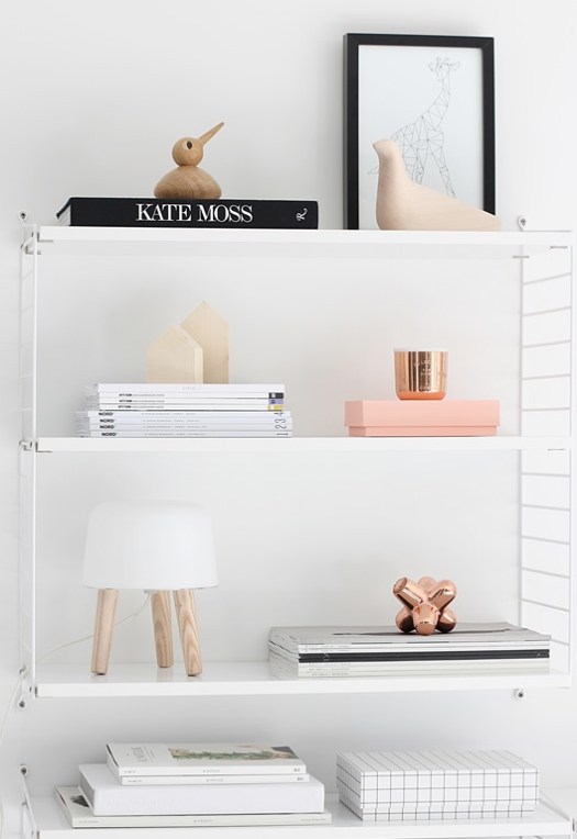
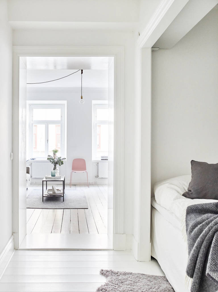
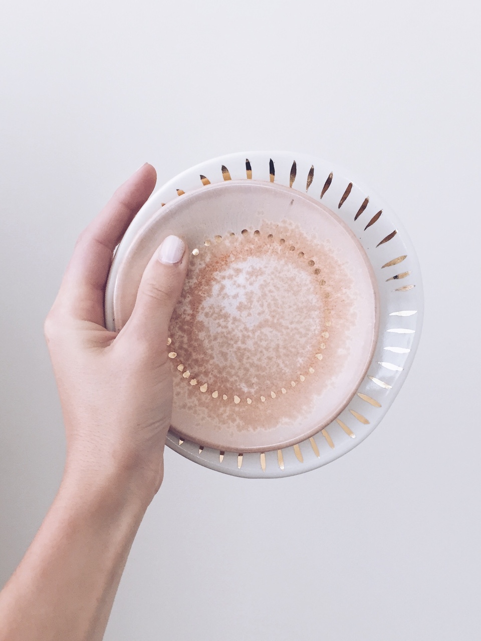
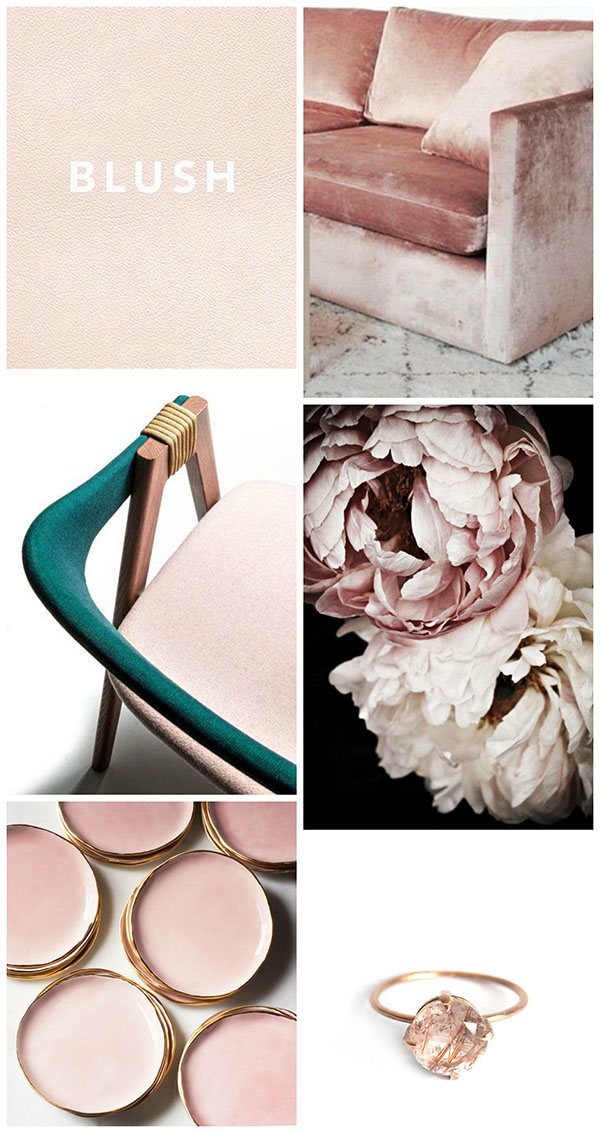
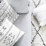
I’ve never been terribly excited about pink, but something has happened. Maybe it’s Spring, maybe it’s how good it looks in Scandinavian interiors, or really with any neutrals, and maybe for once the Pantone color of the year is having an effect on me. I usually don’t subscribe to that trend but I’ve been noticing rose quartz a lot everywhere and I LIKE it. I also believe any lover of copper has a natural affinity to blush colors since they can be so similar in tone, and copper is definitely growing on my love list this year. Consequently, I’m feeling very inspired to incorporate blush into a project soon. How do you feel about this soft and adorable color?
Images: 1 | 2 | 3 | 4 | 5 | 6 | 7 | 8 | 9 | 10 | 11 | 12 | 13 | 14 | 15
I’m exactly the same as you! I don’t think I’ve opted for anything pink since I was about 12, but all of a sudden I want everything in the pink version of it. I think blush is a different more subtle version though and definitely not a barbie pink! Lovely post xx
http://www.girlglobalising.com
Yes yes yes, no barbie pink, but a soft powdery pink is perfect. I have yet to get something in a pink version but I see that in my near future haha!
Pink has always been my favourite colour since I was a little girl, so when ‘blush’ started to trend in interior decor and pretty much everywhere else – I couldn’t be any happier! Lovely post :)
Kathy x
http://www.alongcamekathy.blogspot.co.nz
I was never that pink girl! But I so dig where it’s going with interiors lately. So glad you enjoyed this post!
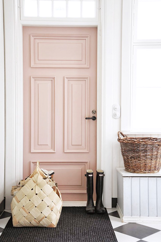
Please, please, can you possibly tell us the paint color of the beautiful blush door, with the woven basket, and the rain boots in the front of it? It’s THE most gorgeous shade of ‘blush’ I’ve ever seen! :) Thank you!!
Hi Denise! I truly wish I knew but I don’t, I’m sorry!
Bridal rose from Benjamin Moore is a colour I have used a lot — flattering and elegant. It is similar to the colour of the door in that photo. :))
I love blush pink. I think it’s so pretty in home decor paired with gold. I love how modern it looks with black and grey too though. Great inspo pics!
~Krisztina
http://www.krisztinawilliams.com
Yes, I especially love it with gray! And gold is always a favorite ;)
Hey Amy! I guess we have the same taste when it comes to colour and that is pink. But I am more driven by hot pink and more like when it’s mashed up with taupe. There is something sweet about this colour. But I’m loving how your interior is looking in the photographs :)
I adore blush pink with copper and a muted gray/beige. It’s soft and feminine but not so in-your-face like a magenta or even a rose.
Thanks for the inspiration! I’ll need to incorporate some blush into a DIY for Spring ;)
-Clarissa @ The View From Here
I agree! And maybe you can help – I have navy walls (Tempe Star from Sherwin Williams), and paired it with a small pink wall. I went with Rachel Pink from Sherwin Williams – the sample color gave me that “yes this is an amazing match!” feeling with the navy, but now on the wall it’s a sickening Pepto-pink! What did I do wrong?!
You painted a large swatch on the wall first? I’ve heard of others testing wall colors but without seeing how it looks at all times of the day and then not liking it once they have to live with it and see that it’s not what they expected in daylight/night/adjacent to another wall color. I don’t have a ton of experience with painting walls (darn you, rental!) but I know that paint can look totally different in one room than in another, so painting on a large swatch and looking at it throughout the day is key!